Instagram continues to be the leading visual platform and a reliable source of new friends, followers and exposure. So you really need to put in some more effort to stand out. That means you need to make a visually pleasing Instagram feed. By visually pleasing, it means a consistent look. When your feed looks good in general, people are more likely to like your photos, follow you, and come back for more. It is the key for converting visitors into followers.
Now, there are a few tips and tricks that beautifying your Instagram feed really simple through visually planning your Instagram posts.
Ready? Let’s get going!
#1 Visually Plan your Instagram Feed with an App
Here’s the key
tip on how to make your Instagram better visually: Planning. By planning your feed, it helps you see how your photos
look next to each other and adjust where needed in order to achieve the
cohesive look and feel of your dreams. Nearly nobody can do it on his/her own,
and even IG professionals use a variety of applications to know in advance what
their feed will look like. What applications should you not miss?
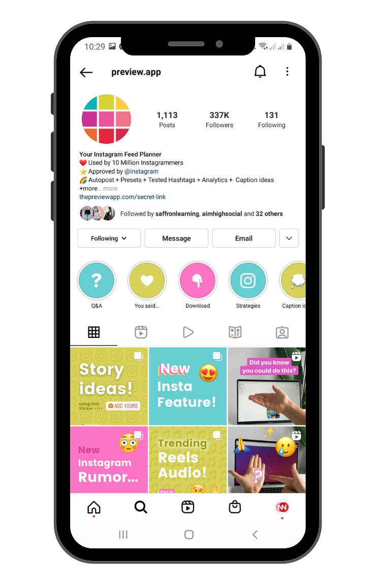
Preview
If you need an
Instagram feed planner app that doesn’t force a monthly limit on the number of
posts, Preview is an ideal option. The mobile app is pretty straightforward and
helps you to plan your Instagram feed. As soon as you finish linking your
Instagram account, you will be presented with the Instagram feed. You can drag
and drop your photos and videos into the layout you want then set a day and
time for your post. When it’s time to go, Preview will send a notification to
remind you to share your post and paste your caption.
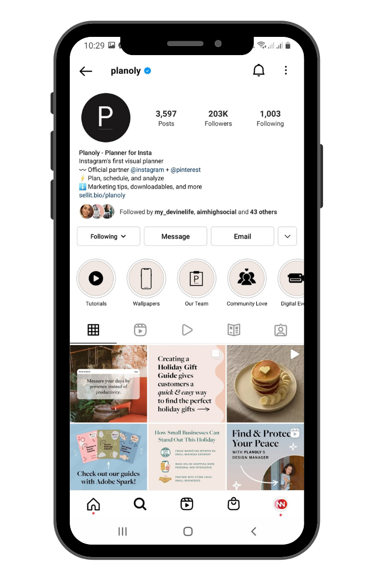
Planoly
Planoly is a
full-blown social media manager and not just an Instagram feed planner.
Foremost, it lets you link both Pinterest and Instagram accounts in the free
version. So, you can import photos from Pinterest to Instagram or upload images
to both platforms at once.
#2 Choose a theme
Whether you’re
a brand, a small business, a freelancer, a blogger – anything – you need a
theme or themes for your grid. So what do you want your theme to be? Grunge,
moody, boho, tropical, colorful, minimal or white?

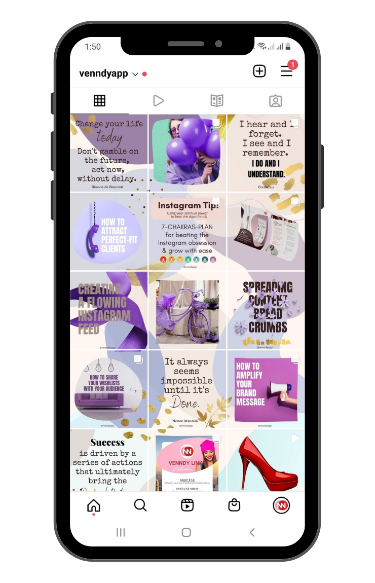
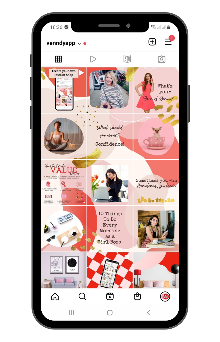
#3 Think colors
Wondering how
to make your Instagram pretty? Try adding splashes of color to your visual
planning approach!
To color coordinate:
- Pick 2-3 colors you know you will always use in your photos
- Then space out your photos in your grid to balance your theme
Examples:
#4 Choose what you want to post about
A theme is not
just about the colors in your photos. It is also about what you post and talk
about. You should think about what you are the most passionate about and what
you want your Instagram to be known for.
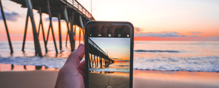
Pick a few things you absolutely love. This is your content, your story, your theme. Don’t be afraid to let your personality shine.
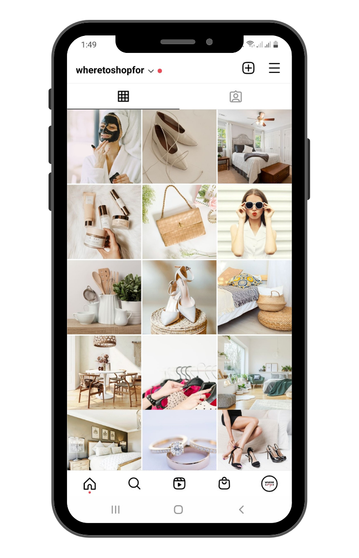
#5 Choose one filter only
Color filters
will give a specific mood to your profile. To make everything look uniform, it's
a good idea to choose only one and in advance - do you want to have photos in
warm or cold shades? Do you like crazy colors or rather monochromatic tones?
Choose a photo
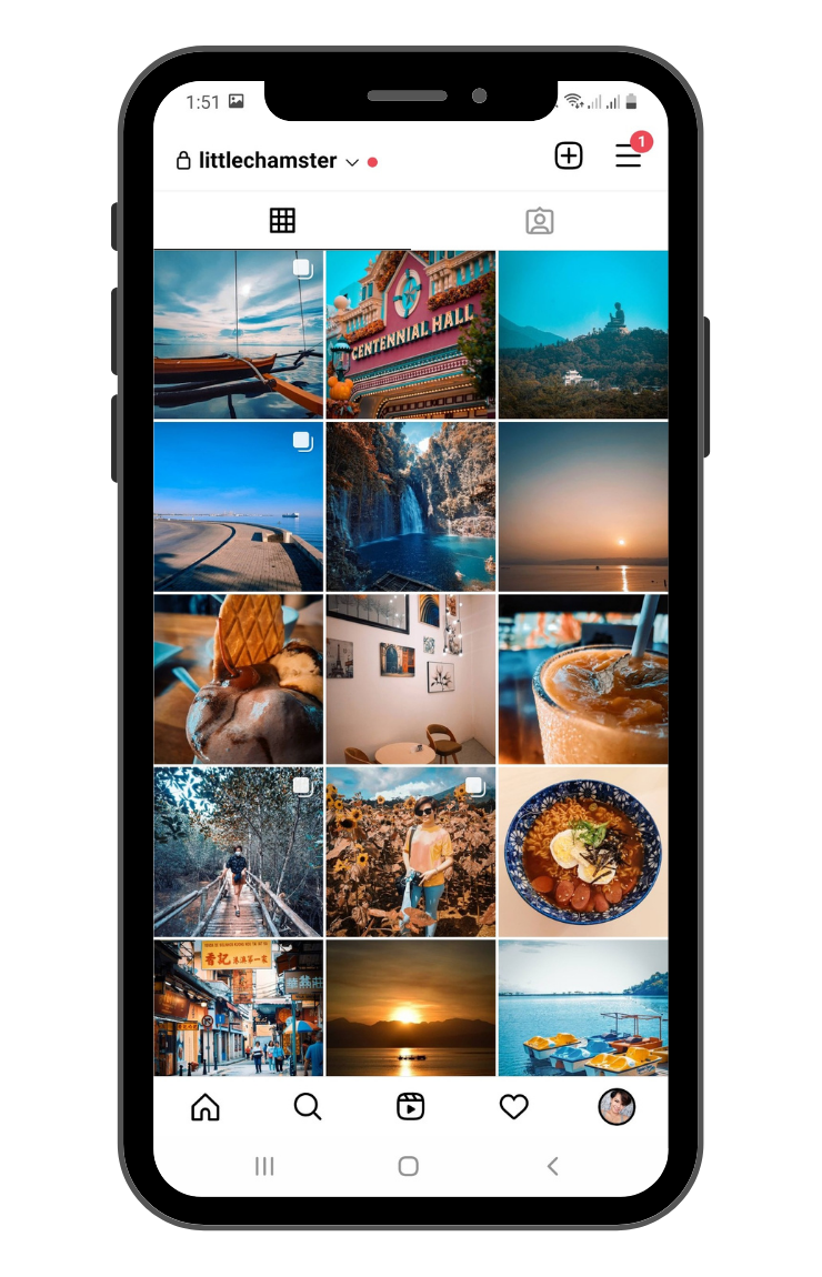
editing application and a specific filter to apply on all photos. Two of our
favorites for easy, on-the-go edits are VSCO app and Adobe Lightroom. Easy and
functional! Look how consistent a feed looks like when you use the same filter
on all the photos all the time:
#6 Preview Your Instagram Feed
It’s time to think about how your posts will look as a whole on your feed. No matter what editing style you choose, you’re going to want to think about how your Instagram posts look alongside one another. Basically, you want to make sure it’s easy for new eyes to move throughout your feed and get a strong impression of what your brand is all about.
There you have
it! you already have a clean slate to work on and you’re straight-off ready to
implement other Instagram feed tips.
So let’s get down to business and nail your theme.





You can choose to comment as a guest.